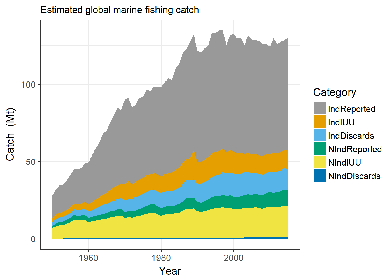
Area plots are used to show changing contributions to a total over time. The time series for each contribution is stacked on top of one another using different colors, as in this example,
All fishing since 1950s. From Watson & Tidd (2018) that we blogged about here. https://t.co/LjhJ3YGXmi pic.twitter.com/e6XKtU41pz
— Sustainable Fisheries UW (@SustainFishUW) May 4, 2018
But it can be hard to pick up on patterns in the data from an area plot. The patterns in the category placed at the bottom of the stack ripple up through the other layers. What if the order of the categories were reversed?
I downloaded the source data for the plot above (catch in millions of metric tonnes) and gave it a try.
library(tidyverse)# annual sum of catch in millions of metric tonnes
df <- read_csv("http://data.imas.utas.edu.au/attachments/ff1274e1-c0ab-411b-a8a2-5a12eb27f2c0/Index.csv",
col_types=cols()) %>%
select(Year, IndReported, IndIUU, IndDiscards,
NIndReported, NIndIUU, NIndDiscards) %>%
group_by(Year) %>%
summarise_all(function(x) sum(x/1000000)) %>%
gather(Category, Catch, -Year) %>%
mutate(
Category = factor(Category, levels=c("IndReported", "IndIUU",
"IndDiscards", "NIndReported", "NIndIUU", "NIndDiscards"))
)
# color blind friendly palette from http://jfly.iam.u-tokyo.ac.jp/color/#pallet
cbbPalette <- c("#999999", "#E69F00", "#56B4E9", "#009E73",
"#F0E442", "#0072B2", "#D55E00", "#CC79A7")
ggplot(df, aes(Year, Catch, fill=Category)) +
geom_area() +
scale_fill_manual(values=cbbPalette) +
labs(y="Catch (Mt)",
subtitle="Estimated global marine fishing catch") +
theme_bw(base_size = 14)
Moving the Industrial Reported catch from the bottom of the stack to the top definitely helps, but it’s not a perfect solution. For example, the bump in the yellow Non-Industrial IUU (illegal, unreported, and unregulated) catch in the late 1980s can be seen in the categories above it. Hard to tell if those other categories have a bump of their own there.
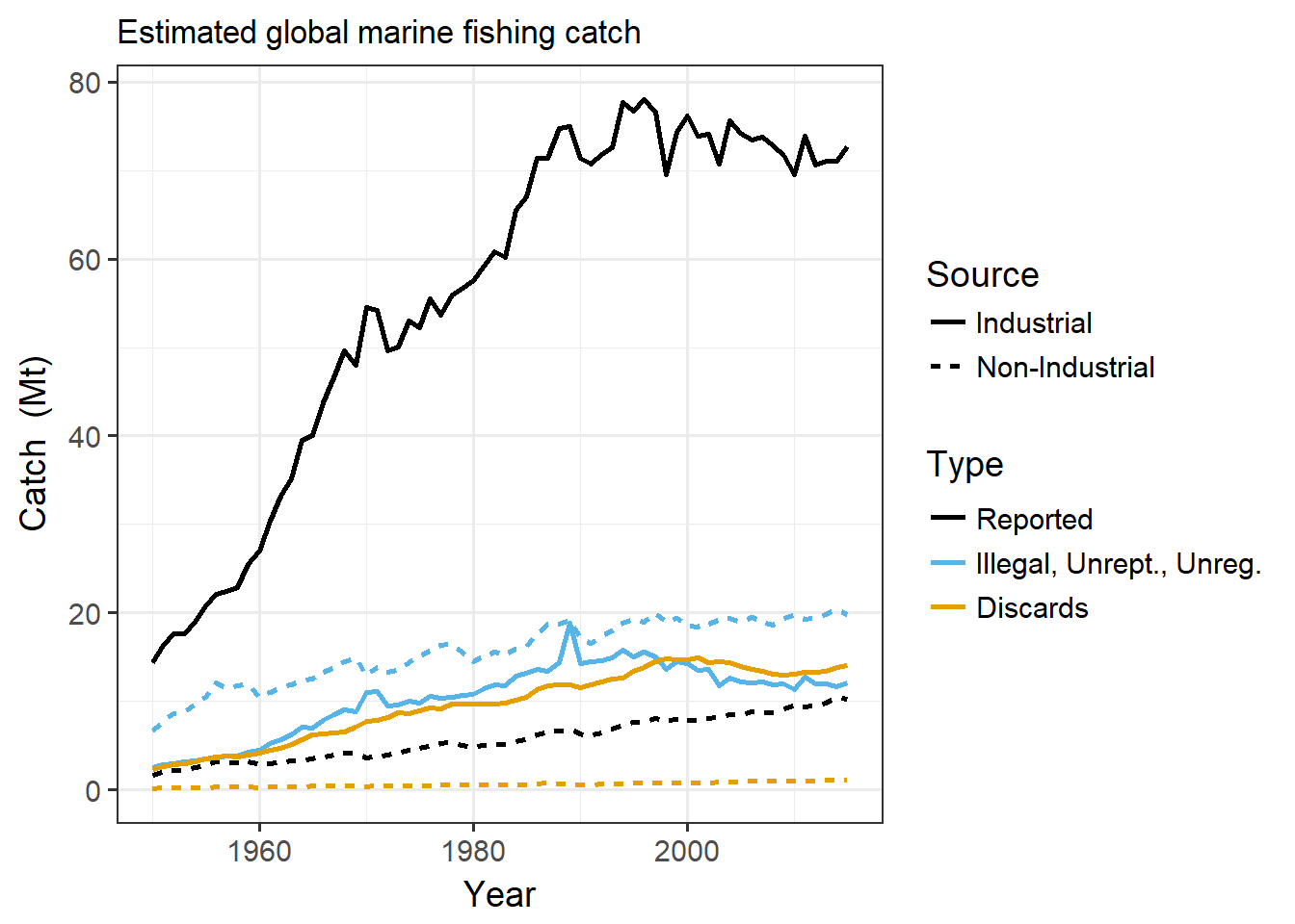
Do the categories really need to be stacked? A line plot will not suffer from this ripple effect.
df2 <- df %>%
  separate(Category, c("Source", "Type"), "Ind") %>%
  mutate(
    Source = factor(Source, levels=c("", "N"), labels=c("Industrial", "Non-Industrial")),
    Type = factor(Type, levels=c("Reported", "IUU", "Discards"),
      labels=c("Reported", "Illegal, Unrept., Unreg.",
        "Discards"))
  )

ggplot(df2, aes(Year, Catch, color=Type, linetype=Source)) +
  geom_line(size=1) +
  scale_colour_manual(values=c("#000000", "#56B4E9", "#E69F00")) +
  labs(y="Catch  (Mt)",
    subtitle="Estimated global marine fishing catch") +
  theme_bw(base_size = 14)
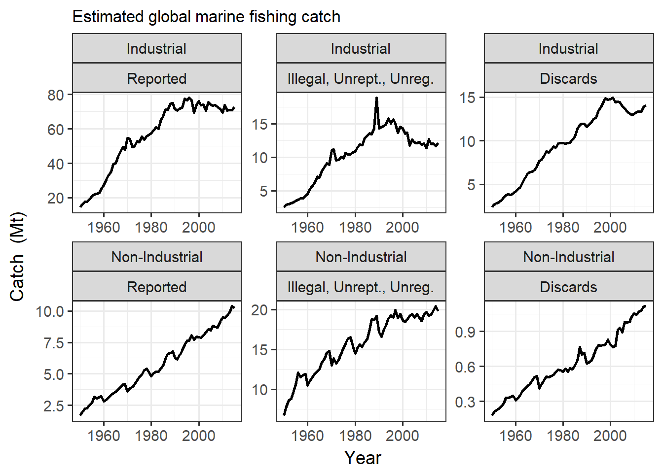
Now there is no ripple effect, but the difference in scale makes it hard to discern patterns in all but the Industrial Reported catch. This could be avoided by plotting each line on its own scale.
ggplot(df2, aes(Year, Catch)) +
  geom_line(size=1) +
  facet_wrap(Source ~ Type, scales="free") +
  labs(y="Catch  (Mt)",
    subtitle="Estimated global marine fishing catch") +
  theme_bw(base_size = 14)
This last view shows patterns in the time series that were not necessarily evident in the previous plots. Industrial catch seems to have leveled off since the 1990s, whereas Non-Industrial catch continues to increase. Non-Industrial Reported and IUU catches both have a 5-year cycle of peaks and valleys. And look at that spike in Industrial IUU in 1989!
Bottom line? There is no silver bullet, no one chart that does it all.