I recently read a post to the Variance Explained blog on How to replace a pie chart. It referenced a series of 6 pie charts presented in a Wall Street Journal article, What Data Scientists Do All Day At Work.
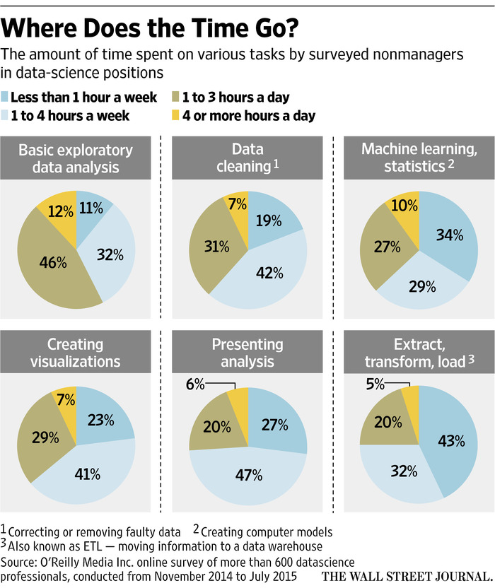
These 6 pie charts are overkill, as was the collection of bar plots shared on Variance Explained.
What do folks really want to know from the survey results? How much time data scientists spend on the various tasks. Can you glean that information from the pie charts? Not easily.
Instead, a single bar chart could be used to show the average number of hours per day that the respondents spend on various tasks.
library(tidyverse)

dat <- data.frame(
  v1 = c(11, 19, 34, 23, 27, 43),
  v2 = c(32, 42, 29, 41, 47, 32),
  v3 = c(46, 31, 27, 29, 20, 20),
  v4 = c(12, 7, 10, 7, 6, 5),
  row.names = c("Basic exploratory data analysis",
  "Data cleaning", "Machine learning/statistics",
  "Creating visualizations", "Presenting analysis",
  "Extract/transform/load"))
names(dat) <-
  c("< 1 a week", "1-4 a week", "1-3 a day", ">4 a day")

# convert the categories to approximate no. hours per day
hrsperday <- c(0.1, 0.4, 2.5, 6)

totals <- sort(apply(t(hrsperday*t(dat/100)), 1, sum))

df <- data.frame(
  totals,
  Task = factor(names(totals), levels=names(totals))
)

ggplot(df, aes(Task, totals)) +
  geom_bar(stat="identity") +
  coord_flip() +
  ggtitle("") +
  labs(y = "Hours per day") +
  theme_bw()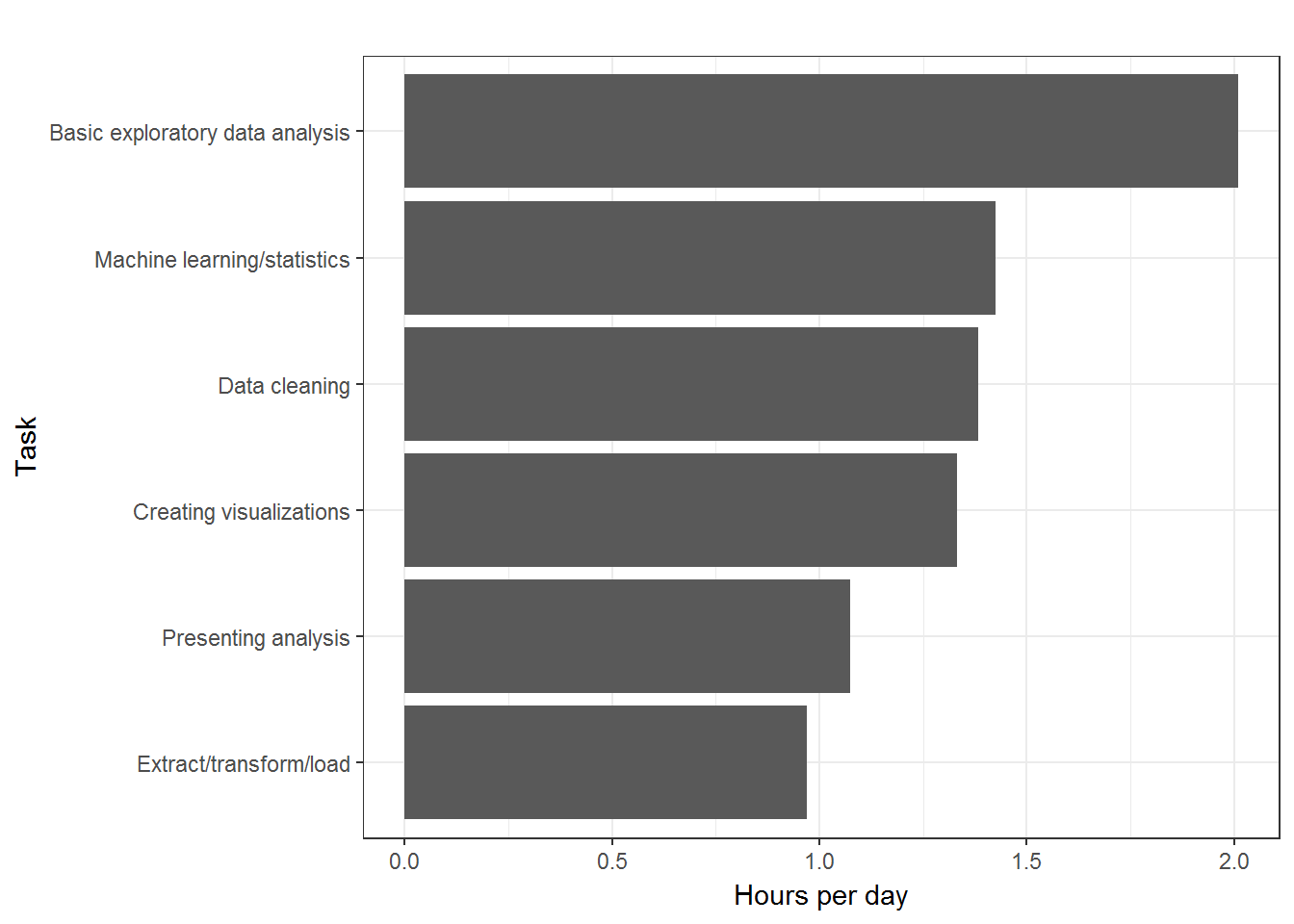
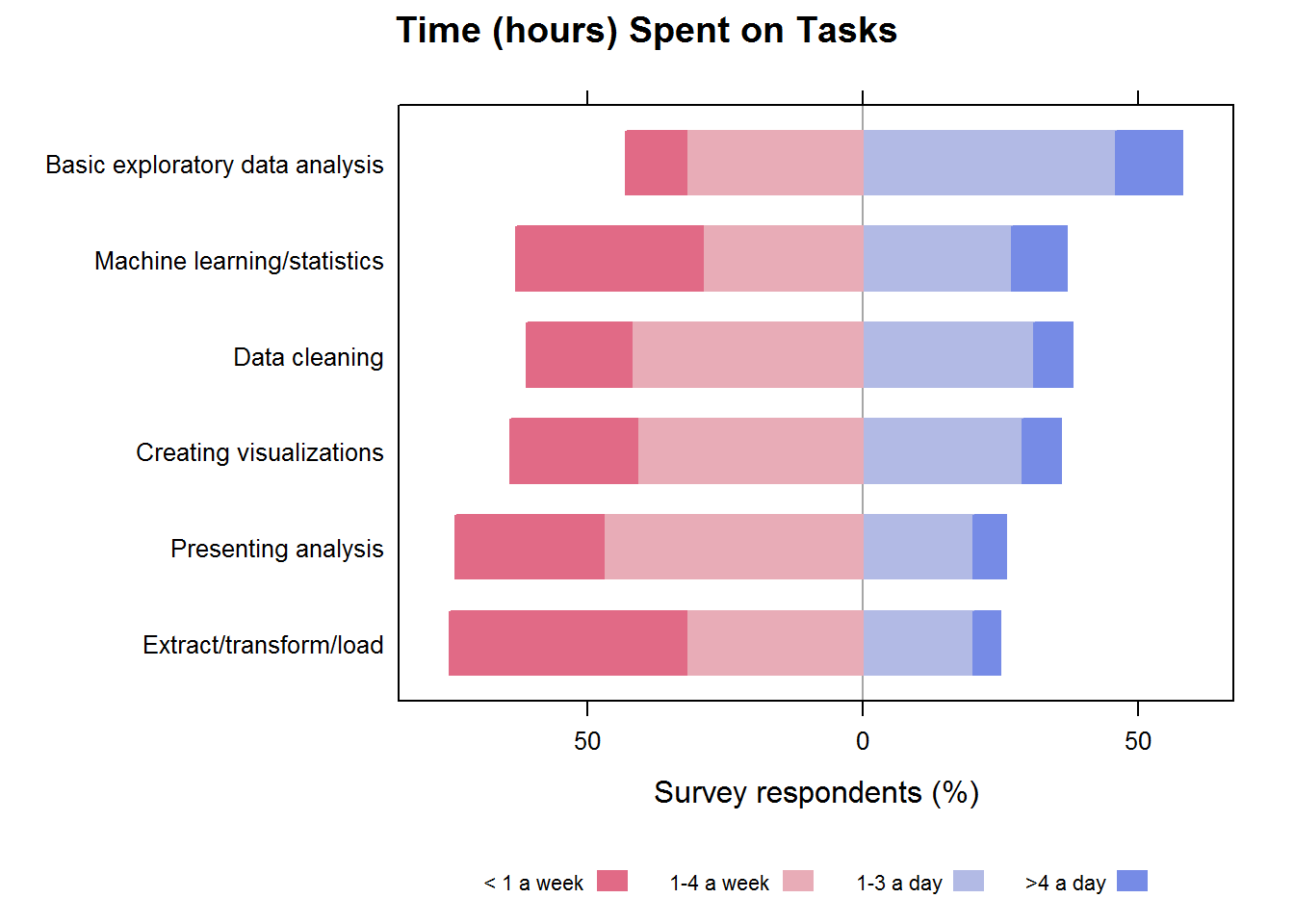
If, in fact, there is some interest in the variability among the respondents (not just the averages), then a stacked bar chart could be used. Centering the bars on the mid-line better illustrates which tasks were most common. But this, too, is likely more than the audience is interested in.
Better to keep it simple, with the bar chart above, from which it is easy to see that most of the time is spent on exploratory data analysis.
library(HH)
likert(dat[rev(names(totals)), ],
  xlab="Survey respondents (%)",
  main="Time (hours) Spent on Tasks")